BR REDESIGN CASE STUDY
The balance between wanting a modern design and satisfying an older audience.
Baseball Reference is a baseball statistics website frequented by baseball fans, from casual enjoyers to die-hard sports analysts. They specialize in providing raw data for analysis and are one of the oldest websites in this category. I chose this brand as a passion project for my first experience in UI/UX design because I am a huge baseball fan and enjoy analyzing the sport's stats.
THE PLAYER PAGE
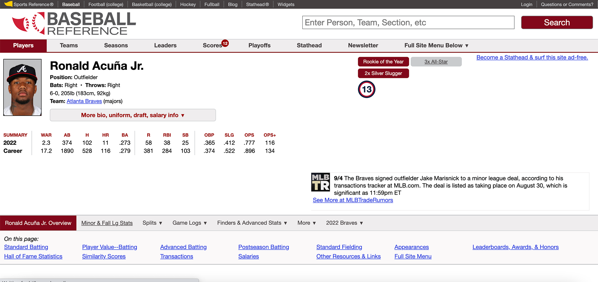
Above is what I chose to reconfigure: the site's player page. It is the most visited page for Baseball Reference, as any Google search of "[Player Name] Stats" will result in a Baseball Reference player page as the first link.
Through some research I conducted asking baseball fans their thoughts on this website, I concluded that the page has a collection of problems.
The Issues
The most prevalent issue is the website's inability to display the information digestible.
The website is a cache of valuable information, but users have a hard time viewing it. One user stated that he had to know exactly what stat he was looking for before opening the page, as otherwise, he would be overwhelmed. Even basic stats, such as AVG, HR, OPS, and RBI, which other sports sites display well, are hidden between more advanced statistics like SLG, WAR, and OPS+.
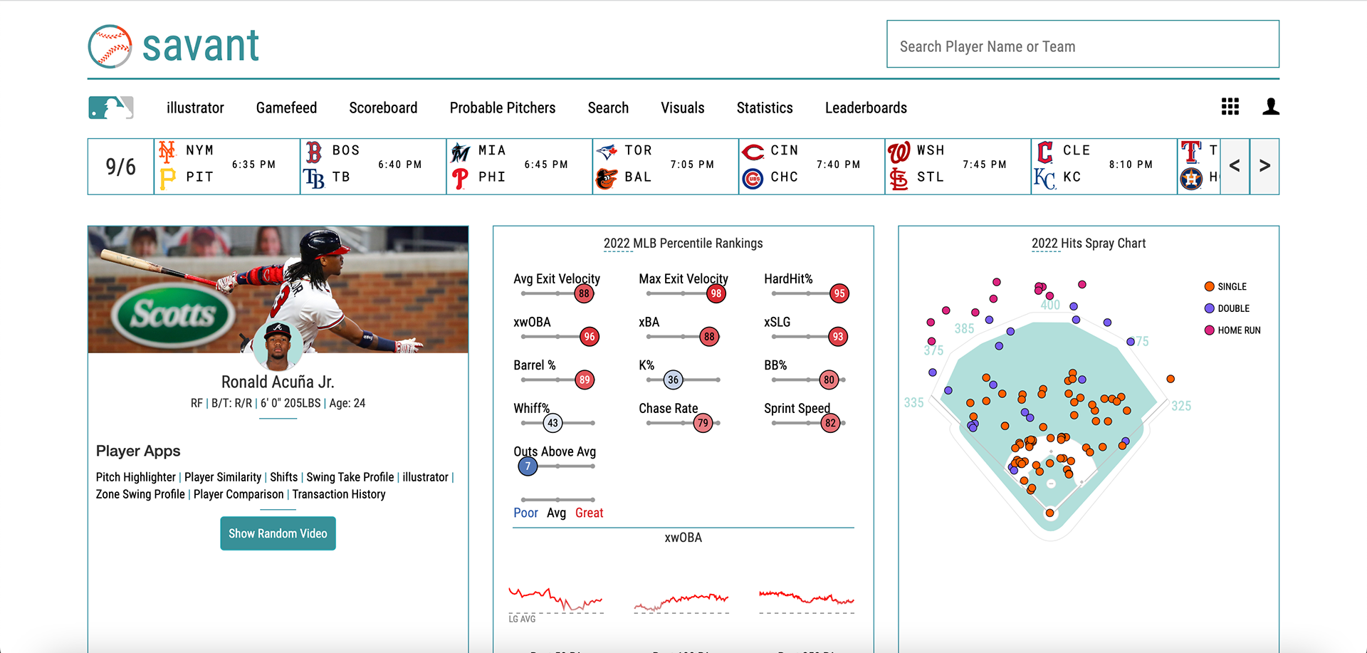
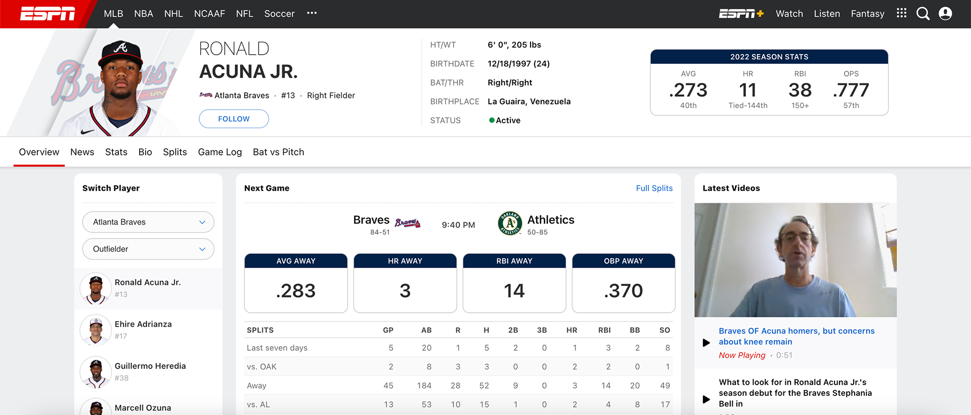
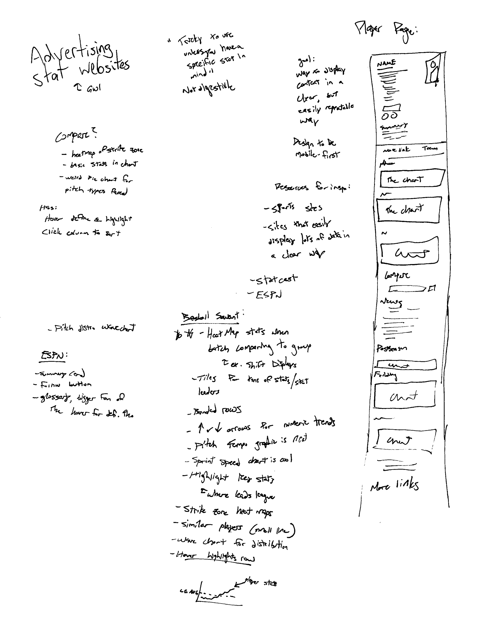
See the below 2 references for how other sites begin their player-specific pages.
I saw this as an opportunity.
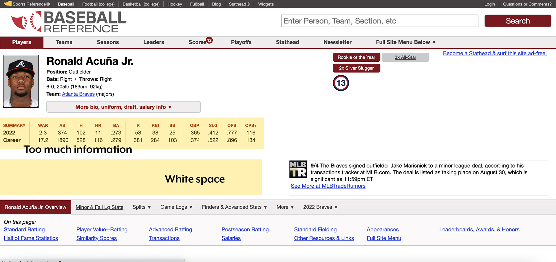
Another issue is the site's poor allocation of screen real estate. There are large gaps of white space that are left unused. This space could be used to display information more simply or even to organize the page in a more digestible way.
Baseball Reference feels bulky, slow, and antiquated compared to other popular sports statistics websites. Their dated feel even forced a few users I interviewed to stop using their site.
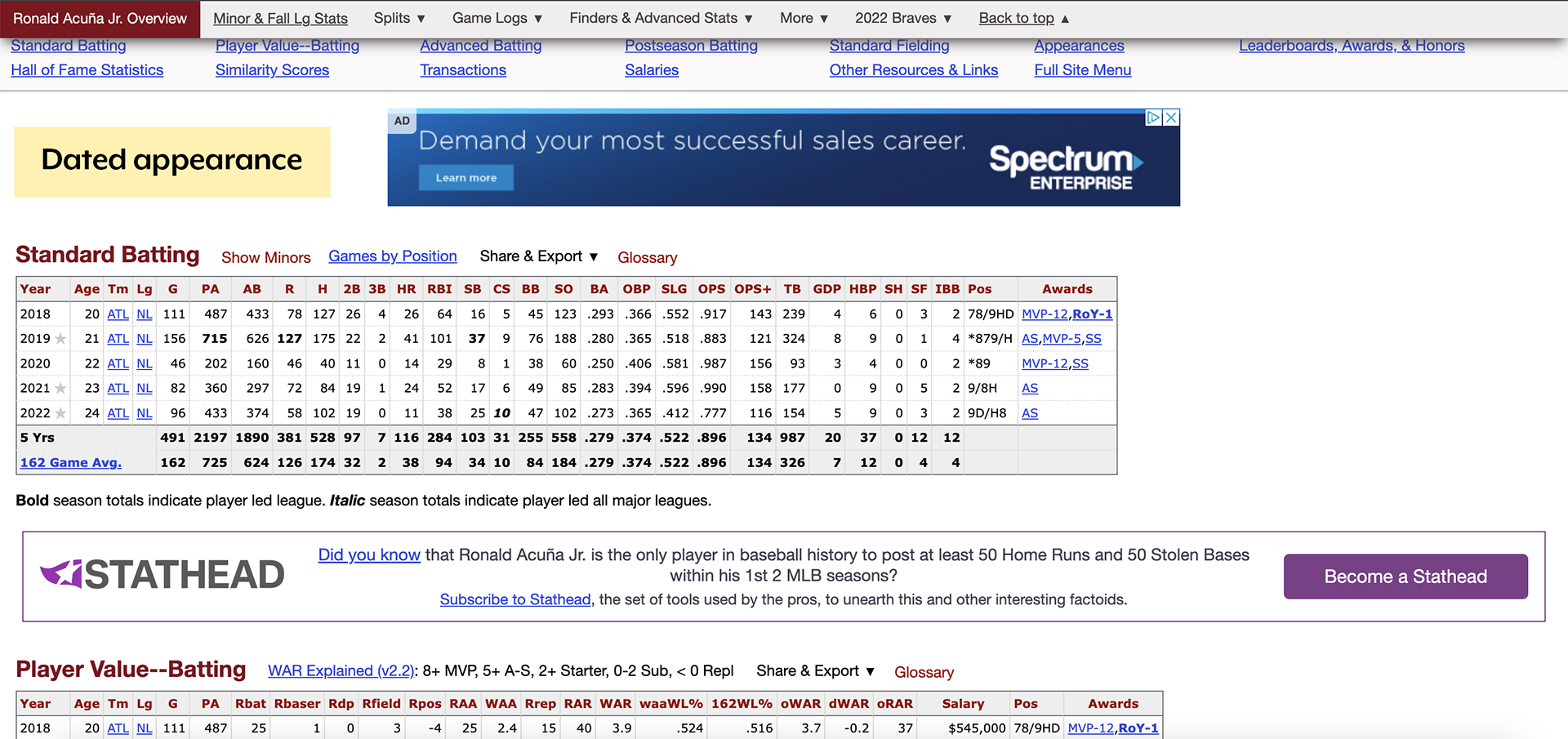
The page's charts, which are responsible for 80% of its content, also have a dated and old-fashioned feel.
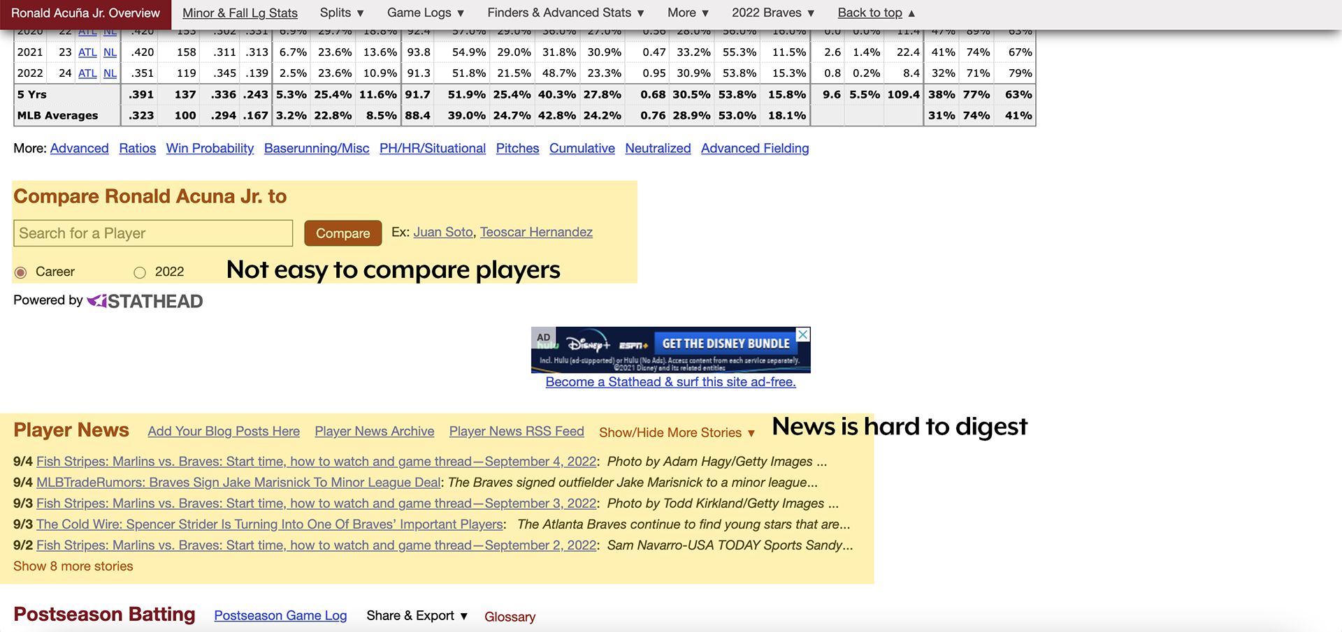
The last main issue found with my research was that it was incredibly difficult to compare players, which many wished they could do.
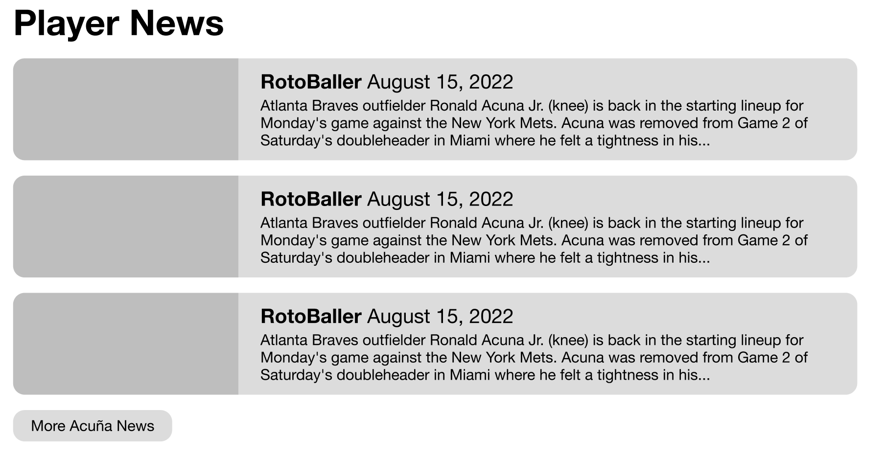
Through my own study, I discovered that no website had an at-a-glance comparison to other players. This could be an area of improvement. On top of this, the news feed is very bare-bones and could use some work.

Lastly, the bottom of the webpage is incredibly cluttered and busy, I wanted to fix this personally.
Sketching
As I was still learning the basics of web design, sketching was fun, though a bit time-consuming. I used this time to plan out what I wanted to do. I also used this as an opportunity to figure out what I needed to learn to make my vision a reality.
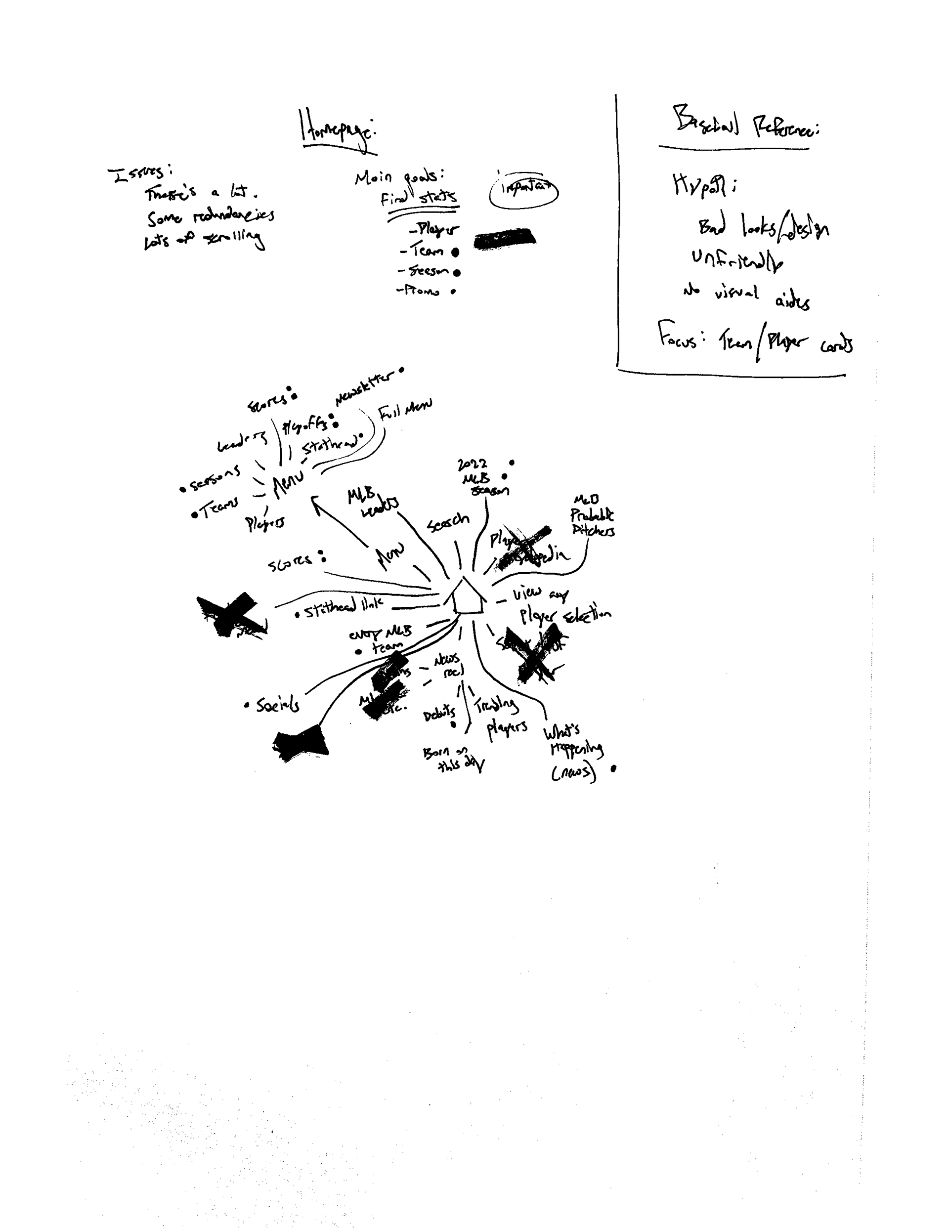
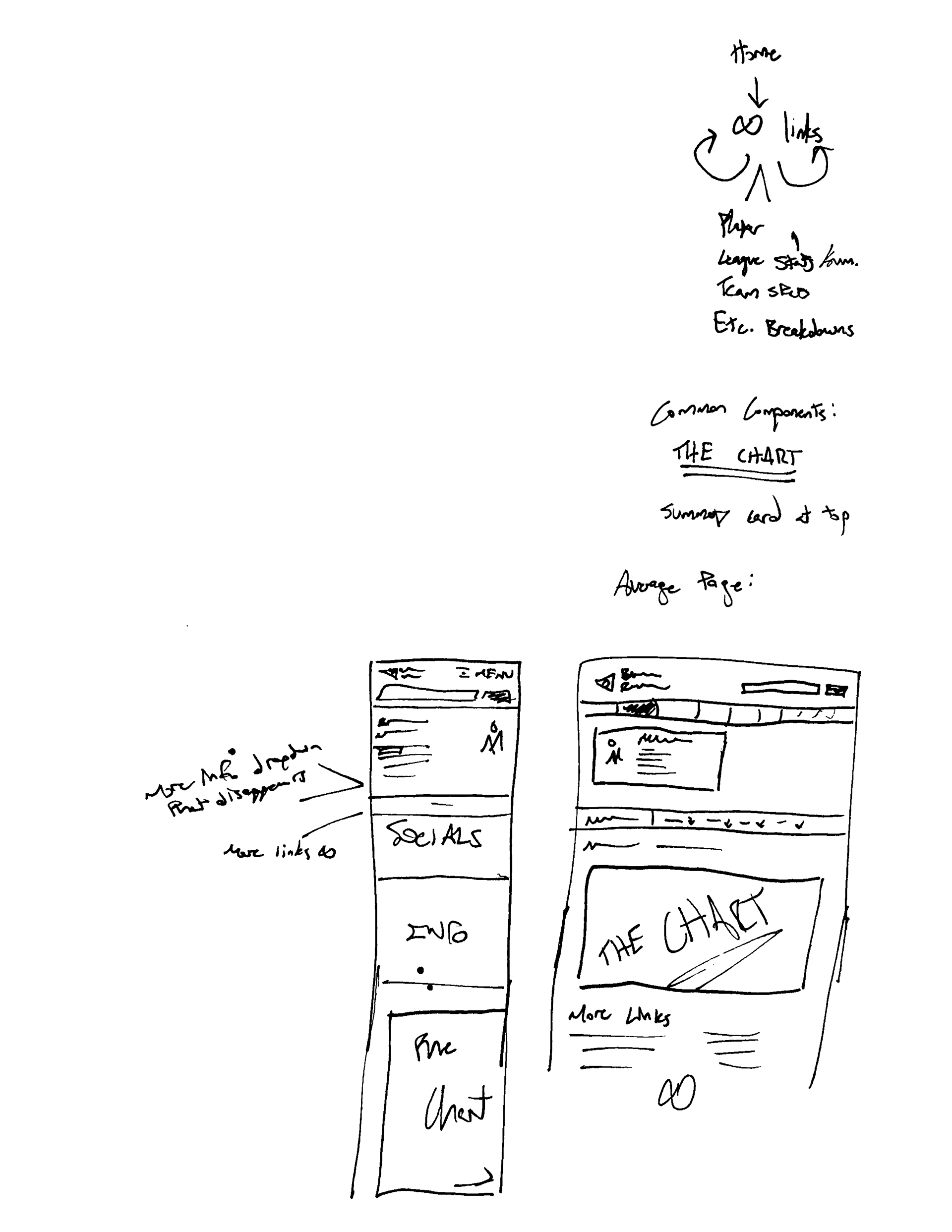

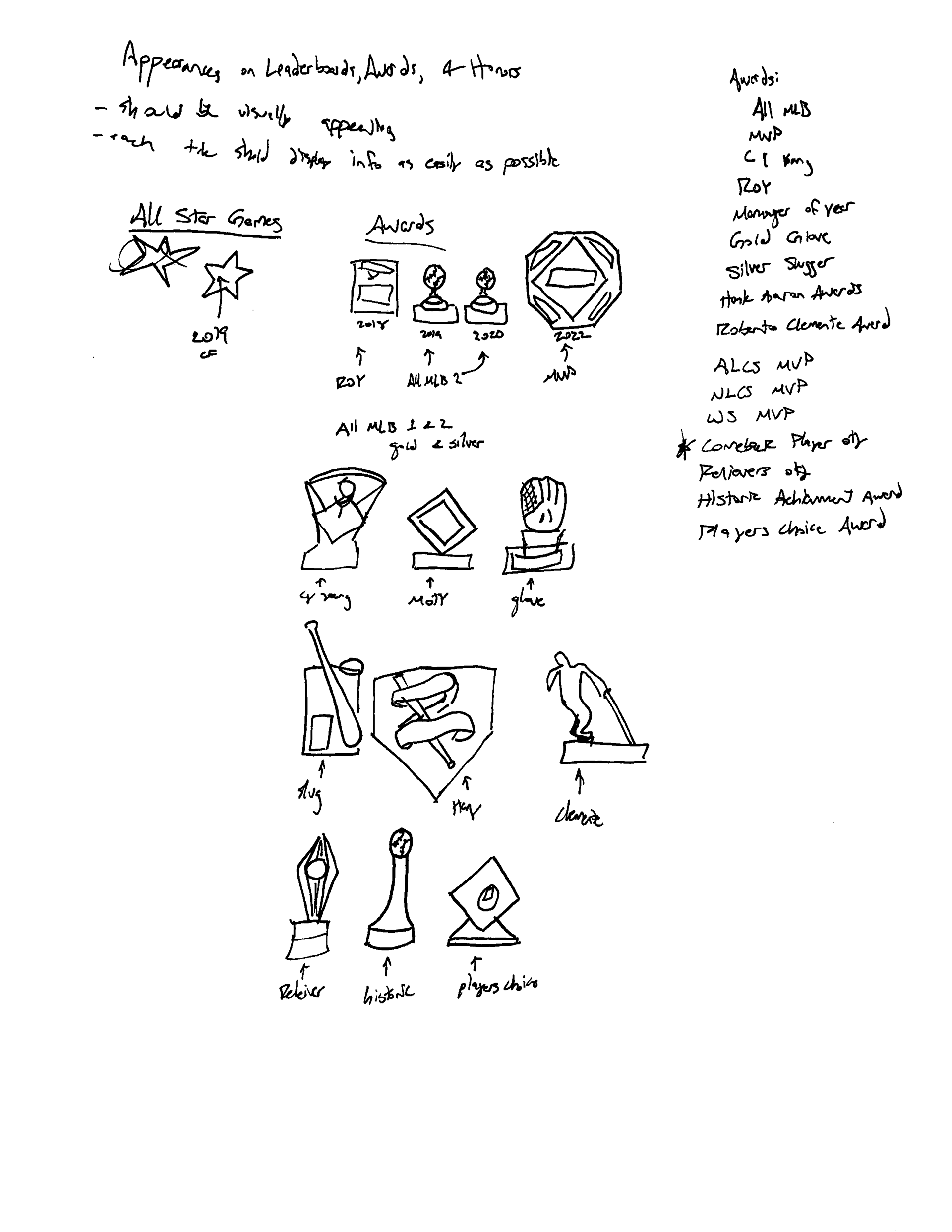
At first, I wasn't sure where I wanted to work. Baseball Reference is a large website with many different pages. I diagrammed out a handful of interactions to understand the architecture of the website. I also researched Baseball Reference to understand the purpose of the website as a whole. As I worked, I talked with people who frequently used the site or other baseball statistics sites. This shaped my choice to redesign their player page.
From then forward, my sketching was focused on what I could do to improve that page. I played with data visualization, cleaning up the dated appearances and adding a pop of color to the website's current, neutral design. I found my biggest focuses were how I could display their copious amount of data simply and how I should structure the player page so that it feels familiar to the user in order to increase ease of use.
Next, I framed my sketches. This is where I made the biggest discovery: the stat card.
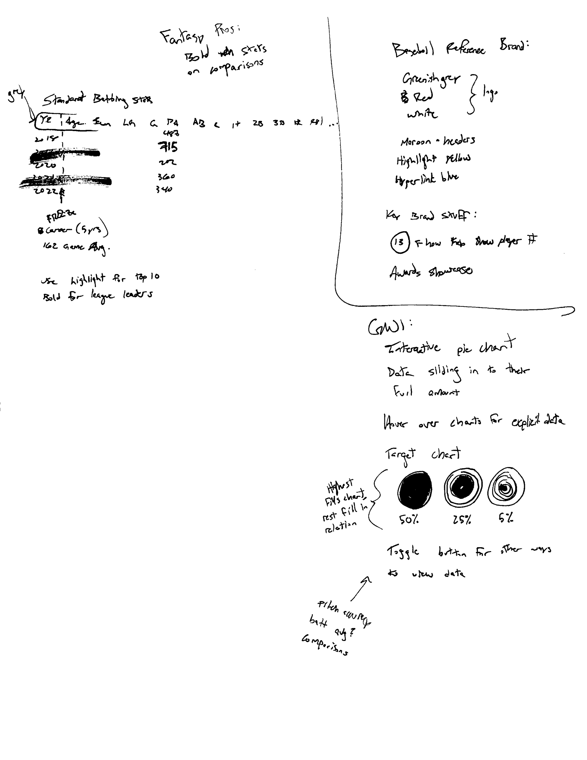
THE STAT CARD
The stat card was the first in my journey to creating a more easy-to-understand baseball statistics player page.
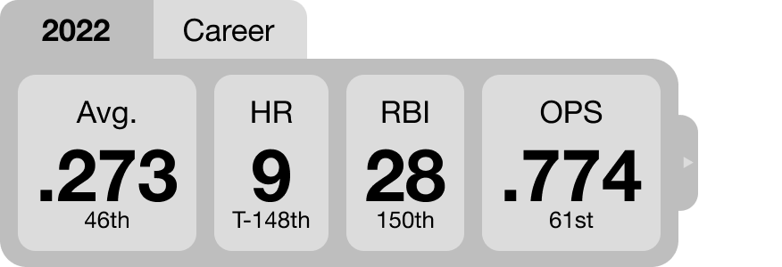
This card allowed users to view the key stats of their player and where that player stands compared to the rest of the league. Other sites, such as ESPN, have a stat card as well. I wanted to differentiate from them by providing users the option to expand the said card to see more data. Baseball Reference is meant for more stat-minded users, so they should be able to see the nitty-gritty details if they wish.
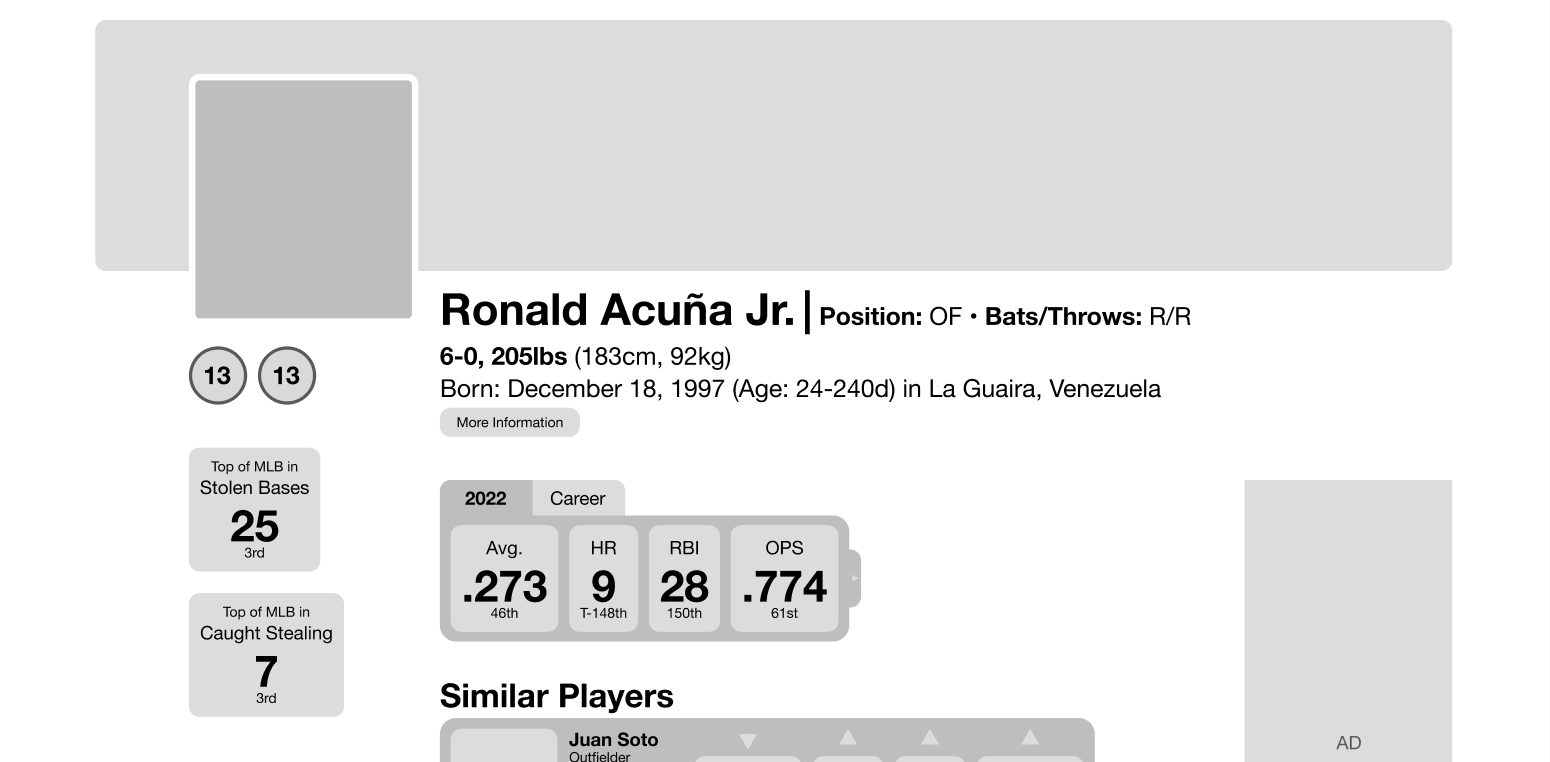
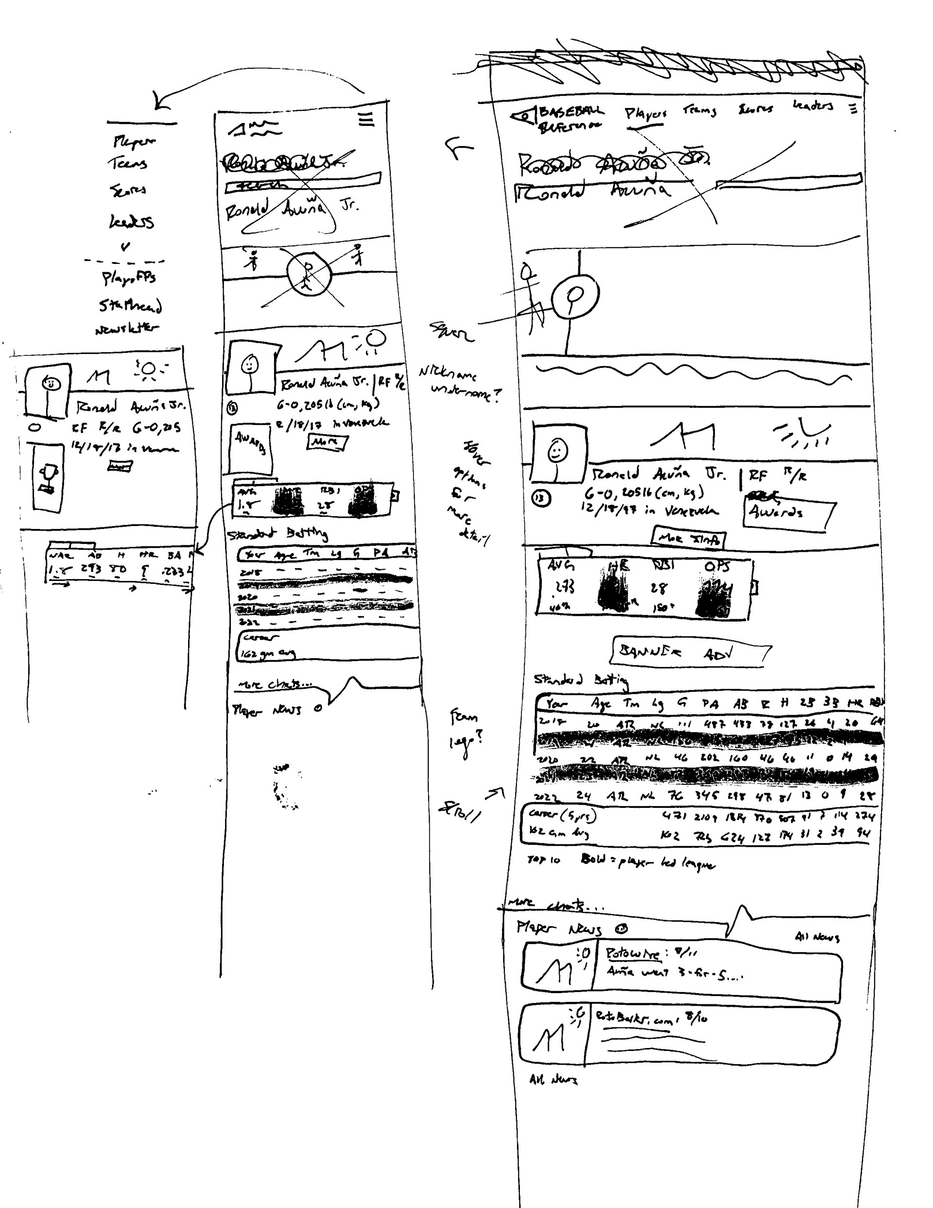
I placed the stat card under the player's basic information. Again, I kept much of the detailed information hidden, as it can be overwhelming to see every detail of a player's life all at once. I also reorganized much of the information on the page. I added a player banner and a "profile picture," which made the page look more approachable than a raw data library. Additionally, I added player highlights on the left side of the page.
The player highlights provides users with an at-a-glance look at what that player is leading the MLB in currently. This, in combination with the stat card, provided users with vital information immediately, whereas before, they would have to search endlessly for what they wanted.
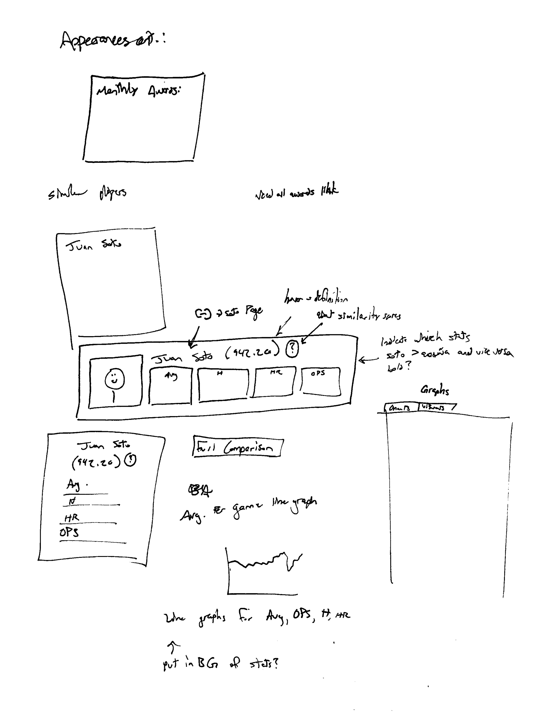
Player Comparisons
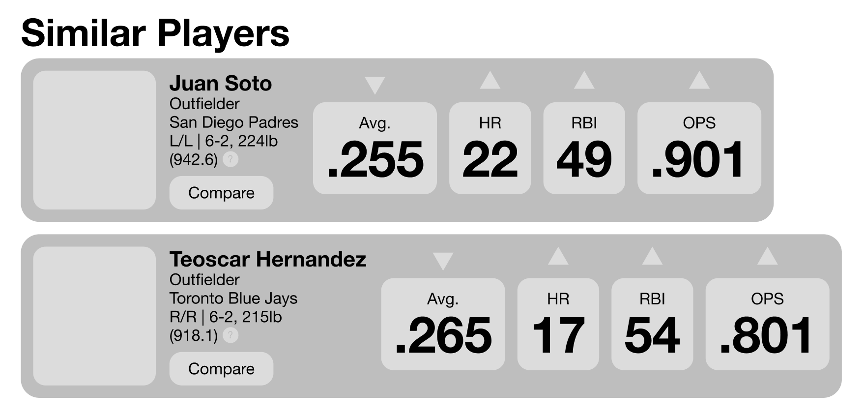
The player comparisons were also a pain point for users. Baseball Reference does not have an easy method of comparing players. Their solution is on another page and is very in-depth. My solution is to adapt my stat card to showcase key stats for an at-a-glance comparison to some ballplayers who are similar to the focus player. It shows who is better in which statistic with simple arrows pointing either up or down (higher or lower).
BR has a unique method of comparing players called the "Similarity Score." The number in parentheses is that score, when users click on the question mark, they will be directed to a page that explains how the score works.
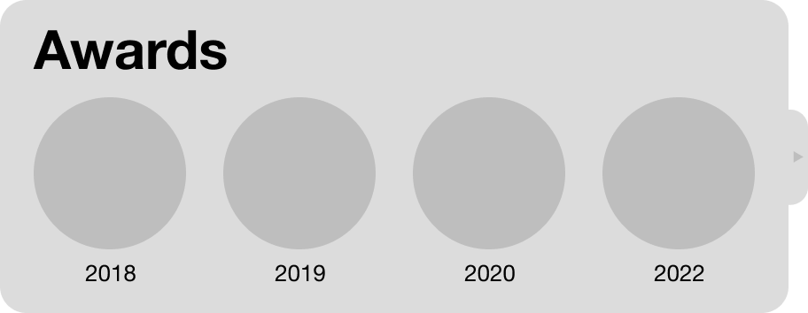
Below the player comparison is another at-a-glance showcase of a player's most important awards for their performance. Below that is the re-designed player news.
After that is my proposed collaboration with FanGraphs to add a visual element to the data. FanGraphs is just as in-depth as BR, providing users with another way to learn more about their favorite players.
Then, just in case people want to look at the raw data, the redesigned charts.


My biggest addition to the player chart is pointing out when a player either led the league or was top in that statistic. This is yet another way I have allowed users to learn where their player is good quickly and simply.
FINAL PRODUCT
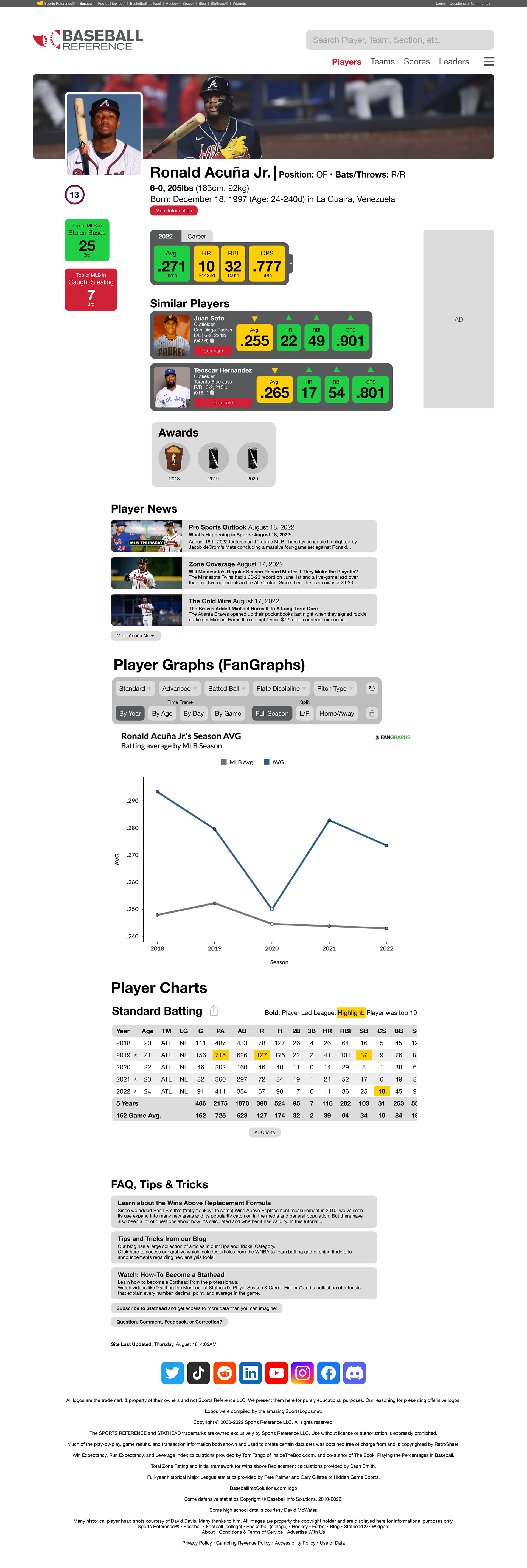
Adding final touches included adding color, photos, and real stats. It is where I can illustrate more of the visual cues included to enhance the user experience. My goal was to allow at-a-glance interactions to exist on a platform with no such thing. I wanted to do this while also acknowledging that users come to Baseball Reference because the site has very detailed statistics. Color-coding these detailed stats allows both at-a-glance interactions and the nitty gritty.
Other ease-of-use additions in the final player page include a much cleaner end card and social media selection. The bottom of Baseball Reference's FAQ menu and everything below it was that it was cluttered and difficult to navigate. Simplifying it solves this issue.

Of course, I have to end with the expanded stat card. Color-coded to show where a player is top 50 in the league (green), middle of the pack (yellow), or dead last (red). Hopefully, no player has to see the red tile.